MARKKIT APP MENU
Cleaning up a busy menu to help users navigate the Markkit app
Overview
Markkit is an early stage eCommerce startup, focused on delivering a mobile, gamified shopping experience. The Markkit girl is in her teens and early twenties. She’s trendy, always on her iPhone, and on the lookout for the latest fashion deals and steals.
The Markkit app had a lot going on — games, shopping, social networking — and our users had a hard time understanding what to do and how to do it. We saw a big drop-off in repeat use after account creation, so this project attempted to help users find what they were looking for and better understand what Markkit has to offer.
PRODUCT GOAL
Increase user actions / engagement
TIMELINE
3 weeks
ROLE
Head Of Design + UI/UX (sole designer)
TEAM MEMBERS
Product manager, copywriter, iOS engineer
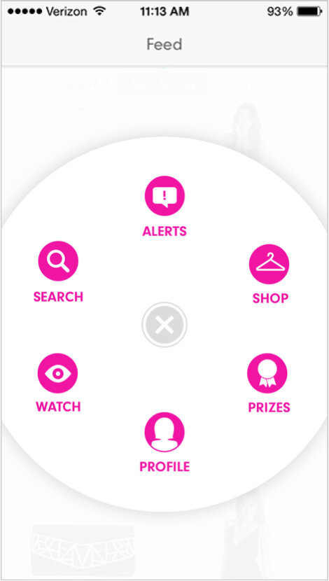
ORIGINAL APP MENU

Challenge
Through user interviews and analysis, we found that the main problem was education — our girls didn’t know what Markkit was or how to use it. The original menu was modeled after the often replicated Path app menu. In the Path app, the menu was revolutionary, but it made no sense for Markkit.
Markkit was a complicated product — one part ecommerce, one part gaming, and one part social network. That’s a lot in one app.
Solution
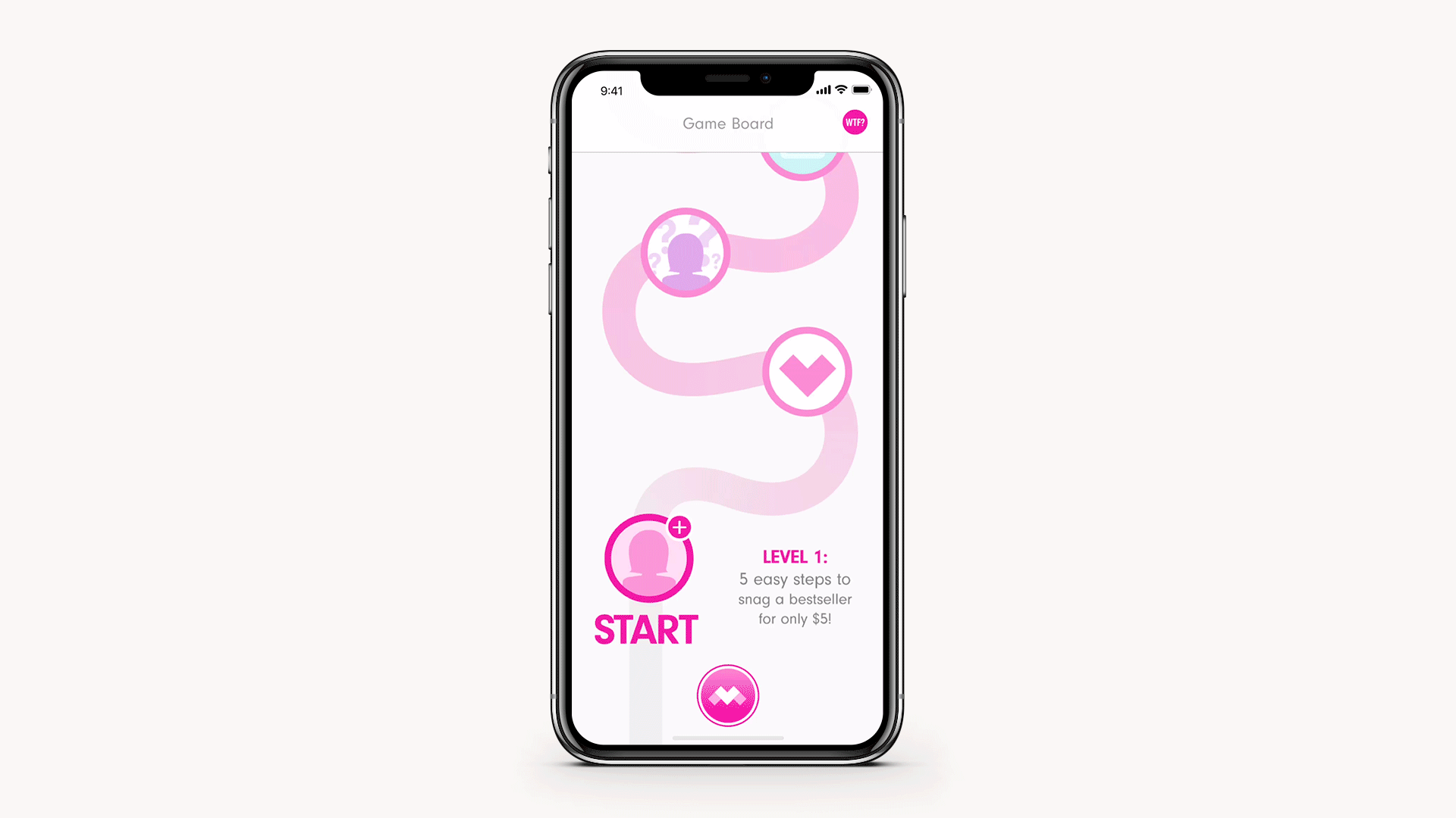
We needed a solution for new users that helped organize and educate.
I proposed a new menu solution that categorized the main value props within the Markkit app — Play, Shop, You. Instead of hiding what we thought was the secondary purpose of the app under a “more” button, we exposed all the app had to offer, and positioned our top priorities front-and-center.

Results
Markkit came to an early end. We had a million ideas, but lacked the time and resources to see them through.
NEXT STEPS
If I’d had more time, I would’ve compared click-through rates from the old menu to the new one, and game actions from before and after the new menu was implemented. I’d like to assume that there would’ve been an uptick in both click-throughs and game actions because of the redesign, but unfortunately we’ll never know.
CREATED USING
Photoshop
Illustrator
Google Analytics
MIXPANEL
Markkit users